Friday 22 June 2012

Magazine Experimentations

Magazine Experiments
This is an evaluation of Experiment 1, I like the use of black and white images and text and how its been done on an piece of tracing paper, with bombs and faint yellow traces saying "conflict in words and images" witha small rendering of a bomb.

I really like this magazine layout, for its use of black and white boxes and how your eye is firsly drawn to the text at te top left hand corner and then goes along to the Image of a tank wreckage. The use of text is quite good in this one in the way that at first its big then medium and then small text with the picture to the side with big text.

I like this magazine layout because it uses a good range of Images and text joined together, I like the text and page layout and how it has a sub-heading with the natural page text with the start of the paragraph and information with a Big Letter. What I think I could do to improve this was to have more pictures encorparated together and make up the overall Image of a plane. 

Magazine Layout Experimentations

Magazine Layout Experimentations
I really Like this one for its its simplisticness of text and how the Image has a text background to show the reason behind it and the way its like a sports magazine because the Image is coming out, also with the text at the fore front of the Image its makes it easier to view and see whats happened. 

I like this one for the easiness of the Image and text being together and how the white ooutlined writing covers the Black photo of the tank wreckage. This seems more of a Poster Image but I still Like the basicness of it.

I like this piece of art for its use of posotive space and how I have folded over the image and how it creates a surface to right or paint on. I really like how the image is life-like and that I can use the Image
to write on aswell with paint in Black.

I like this newspaper experiment for its use of negative space and shade and how autimatically it gives you a different percpective of the image and background with text because theres nothing there and it doesnt seem sensible.

I like the black, white and red in this certian work sheet because it shows a style of painting and drawing, and how the text font contrasts with the planes firing a misile.

I like the use of yellow involved with black and white because the plane stands out over the big missile head in the Back ground, though I dont like the faint yellow foregroung writing of "Conflict in words and Images" as it doesnt stand out.

Magazine Layouts

Magazine Layouts
Here is a small Image of a magazine Layout, its very nice indeed because of the simple edited Phots on the right hand side, Then with a title and building upside down using good text and image and a photo underlined also with text.

I like this one for the simple black and white shades, this makes it interesting because of the free space and then black background and white text, I like this also for the way numbers are used to capture the form of a human being resting her arm on the banister rail.

This one I like most for its simplisticness of Image the in its self it is very interesting indeed as the head and potrait of the body uinderlines a much more bolioged way of Image creation and Life memorabolia, and how life so good when you think posotive.

Augmented Landscape

Augmented Landscapes

The steps I took to get this done was first to upload the photos to the L-Drive and then copy them over to Photoshop. Step 2, do some drawings to put onto the Landscape and photo them, upload them onto a memory card reader and put them as Jpeg files in "My Pictures" from there I open them on Photoshop. Step 3 and last of all I used "Free Transform" and scaled them into size comparison to the Landscape.

Friday 15 June 2012

Character Design for the BBC Ident

Character Designs for BBC Idents
Theis where Ideas I had for the robot Ident and show my level of concentration and drawing ability, and what my thought for robot anime would be, type A, medium build, strong, flexible, smart and tough, whereas with type B a large robot species with big bones, thick tough armour and little brain power, though naturally with a weapon this one choose an axe.


Frankenstein

Frankenstein
I took 2 Images of Ldrive and copied them onto Photoshop and then went into Layers and "Merge down" and this way the human looks like an alien Hybrid.

This one I took a number of pictures from the Ldrive just like experiment 1 and then pu7t them together my Idea was to use the skeleton as the middle and then spider legs, alien legs and coachroach legs and put them together.

I just used the same Techniques and images as before with free transform and mouse tool to move them around to their appropriatte places, though this time I used a bat head.

Movie maker for BBC ident

Movie Maker for BBC Ident
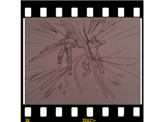
To start of this anime movie what happens is the good alien A is vercing the bad alien B and both are of a different species, The evil alien fights the bad alien in wanting him dead.

The second scene show Alien A to your left and alien B to your right.

Alien B gets to angry, Alien A Kills him.

This scene is Alien A striking and the camera is zoming away, the blow is to strong for Alien B and so he falls.

This is the end scene and shows Alien A moving away after winning the fight.