Brighton Postcards
The steps I took in creating this postcard was first to take the image of the brighton pavillion from the Ldrive, and uploaded it into photoshop, step2 I edited the image and converted it into a black and white copy and took most of the filling of the building out of it and then took changed the Image with filter to "sketch" and converted it to the colour blue, step3 I used th gradient tool for the background colour blue and then the "magic tool" to delete the colour blue out and then overlayed the image with drips of ink and "brighton fringe 2012". I like it, but I could of had it bigger and more stripes of white say 2 instead of 1.
step 1 I used the same process as in post card 1, but this time I converted it to a black and white Image and made it larger, keeping a grey background. Then I used blue and purple drips of ink from the Ldrive and then "Brighton fringe festival 2012" with a purple and red writing to show the frequency of it going from blue to red. I like it but I could of scaled up to dome and made parts of it darker with smaller text and drips in it.
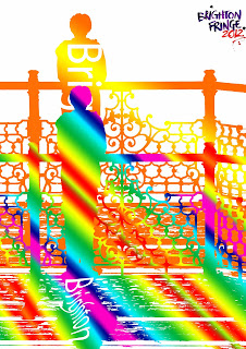
I took an Image of a person looking out to the beach in brighton from the pier and then corveted it into to a smart image and cut it out, then I used the gradient tool for the inside of an image, fiorst with the rainbow and then with orange and yellow. I put text into the Image and overlayed it ontop, then with the second image I used the transform tool and warped the text to make it wavy as if in the shadows. I like the white space and text in the foreground of the images.
I took a different image from Ldrive into Black and white and then used the eraser tol to remove the bottom part of the Brighton Dome. Step2 I made a new page and copied a Image over the page and again used the eraser tool to remove the bottom part of the image, then once done I used the eraser tool for the sky inbetween "BRIGHTON" and ontop and then selected what was tleft and copied it iver to the background Image fo the Brghton Pier and then copied the Brighton Fringe Festival on to it. I liked the Image of the brighton dome with its pure black and white, but I think if I changed the "BRIGHTON" to balck and white and scaled it down to look part of the Image it would look more together and the "Brighton Fringe Fetsival 2012" would stand out more, thoughas it is it looks pretty good with the Brighton text overlaying the background with colour and standing out more.


No comments:
Post a Comment